Warm Burnout
Fully warm palette, minimal blue light, contrast-audited. Your eyes deserved this.
How to install
With Forge Super installed, the button above opens the app on this extension, where you press Install. Nothing is installed until you do.
You can also open the Extensions panel in the app and search for Warm Burnout. The extension's id is warm-burnout-theme.
Don't have Forge Super yet? Download it here.
README
From the extension's repository, written by its authors and not by Mentenaz. See the source.
Warm Burnout
The theme for developers who already burned out but still have deadlines.
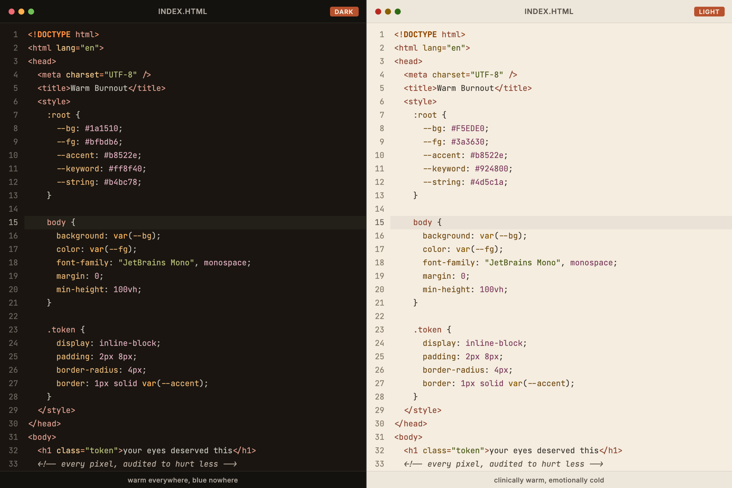
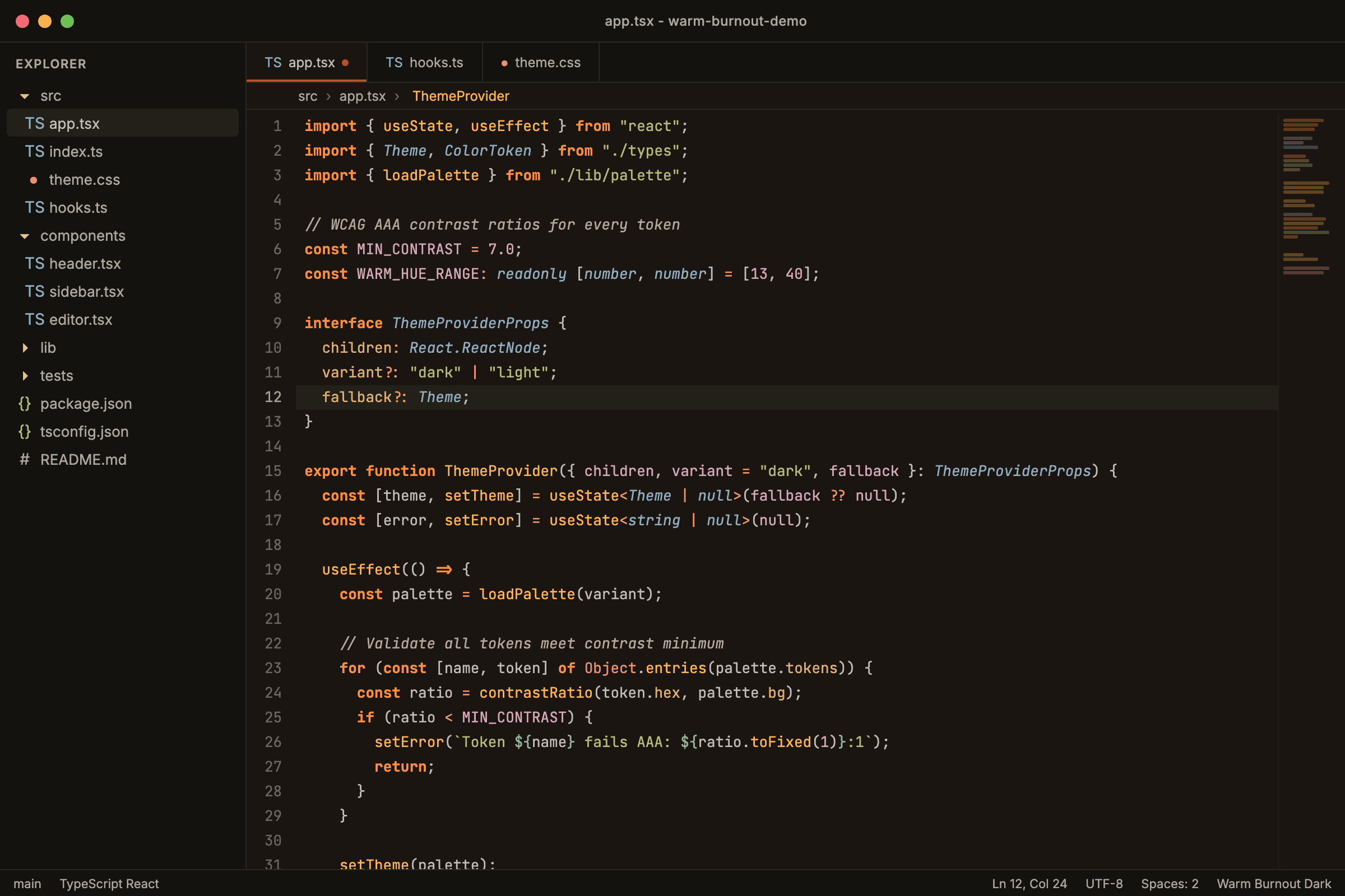
Built on one premise: your eyes are taking damage and your current theme doesn't care. Warm Burnout does. Fully warm palette, minimal blue light, contrast-audited to clinical standards. Two variants: Dark for the 3am sessions and Light for when someone forces you to open the blinds.
Why Your Current Theme Is Hurting You
Most themes look great in screenshots. Then you use them for 14 hours straight and your eyes feel like they've been sandpapered.
The blues, cyans, and purples that make themes look "cool" emit at 450-500nm, the exact wavelength range that suppresses melatonin, triggers digital eye strain, and makes your ophthalmologist wince. Your theme is fighting your body's ability to rest.
Warm Burnout strips out almost all blue-spectrum syntax colors, leaving a fully warm palette (550-630nm dominant) that your retinas can survive.
Eye Safety Audit
Not vibes. Math.
Dark: Every Token AAA
Every syntax color meets WCAG AAA (>= 7:1 contrast ratio) against the editor background. Every single one. Most themes can't even get comments past 4:1.
| Role | Color | Ratio | Style |
|---|---|---|---|
| Foreground | #bfbdb6 | 9.6:1 | normal |
| Keywords | #ff8f40 | 8.0:1 | bold |
| Functions | #ffb454 | 10.3:1 | normal |
| Types/classes | #90aec0 | 7.8:1 | italic |
| Strings | #b4bc78 | 9.0:1 | normal |
| Constants | #d4a8b8 | 8.7:1 | normal |
| Comments | #b4a89c | 7.8:1 | italic |
| Errors | #f49090 | 7.9:1 | normal |
Your comments are readable at 3am. On purpose.
Light: AA Minimum, Sepia Cream Background
The light theme uses #F5EDE0, a warm sepia cream, not white. 14.6% less bright than pure white. Estimated ~4000K color temperature vs white's ~6500K, roughly 40-50% less melatonin suppression compared to white-background themes.
| Role | Color | Ratio | Style |
|---|---|---|---|
| Foreground | #3a3630 | 10.3:1 | normal |
| Keywords | #924800 | 5.7:1 | bold |
| Functions | #855700 | 5.4:1 | normal |
| Types/classes | #285464 | 7.2:1 | italic |
| Strings | #4d5c1a | 6.3:1 | normal |
| Constants | #7e4060 | 6.5:1 | normal |
| Comments | #544c40 | 7.3:1 | italic |
| Errors | #b03434 | 5.3:1 | normal |
All 15 syntax tokens pass AA. No exceptions.
How It Works
Background: no pure black, no pure white
The dark background (#1a1510) is a warm brown-black. Pure black (#000000) causes halation, a glow/bleed effect around text that affects roughly 33% of the population (those with astigmatism). The warm tint eliminates this.
The light background (#F5EDE0) is warm sepia cream. No pure white anywhere.
Three-tier font style system
Color alone fails under fatigue. When you've been staring at code for 12 hours, your color discrimination drops. For the ~8% of males with red-green color vision deficiency, warm tones blur together.
- Bold: structural keywords (
if,return,const). Your eye scans these for code flow. - Italic: types and comments. The single cool accent (steel-blue/teal) + italic makes types unmistakable.
- Normal: everything else.
A protanopic developer running on no sleep can distinguish structure from types from data.
One cool accent: oxidized copper
The palette is fully warm except types/classes: #90aec0 (dark) / #285464 (light). This is the literal color of oxidized copper. One cool landmark in a warm field improves color distinctiveness without adding blue light load.
Cursor: gold, not red
The accent color is red for buttons and badges. But the cursor uses warm gold: #f5c56e dark, #8a6600 light. A red cursor gets confused with error indicators. Gold is visible everywhere.
The Palette
Inspired by materials that age well. Unlike your eyes.
| Material | Dark | Light | Used for |
|---|---|---|---|
| Amber | #ffb454 | #855700 | Functions |
| Burnt orange | #ff8f40 | #924800 | Keywords |
| Terra cotta | #dc9e92 | #8e4632 | HTML tags |
| Dried sage | #b4bc78 | #4d5c1a | Strings |
| Verdigris | #96b898 | #286a48 | Regex, escapes |
| Dusty mauve | #d4a8b8 | #7e4060 | Numbers, constants |
| Coral | #ec9878 | #883850 | Member variables |
| Warm stone | #b4a89c | #544c40 | Comments |
| Aged brass | #deb074 | #74501c | CSS properties |
| Steel patina | #90aec0 | #285464 | Types, classes |
| Gold | #e6c08a | #7a5a1c | Decorators |
Languages Tested
TypeScript, JavaScript, HTML, JSX, CSS, Python, Rust, Go, Java, YAML, JSON, Markdown, Diff.
Zed uses Tree-sitter for syntax highlighting. All tokens mapped from the canonical palette.
Installation
Search "Warm Burnout" in the Extensions panel (Cmd+Shift+P > "zed: extensions"), or install as a dev extension by pointing to the zed/ directory.
Then switch themes via Cmd+Shift+P and typing "theme" to select Warm Burnout Dark or Warm Burnout Light.
Also Available For
- VS Code
- JetBrains (IntelliJ, WebStorm, RustRover, etc.)
- Neovim
- Xcode
- Ghostty
- iTerm2
- Windows Terminal
- tmux
- Starship
- Zsh (syntax highlighting + fzf)
- eza
License
MIT. Use it, fork it, burn it out.